Making Borough Yards happen: the SDS twilight tour
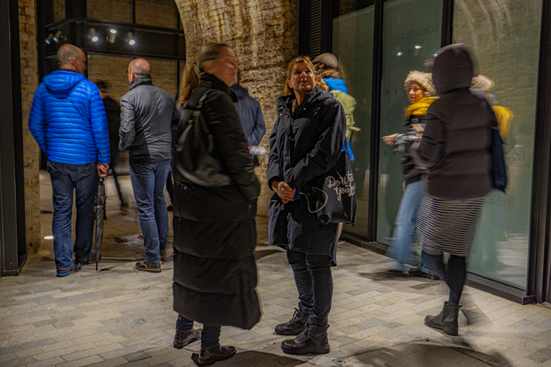
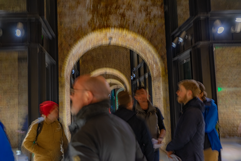
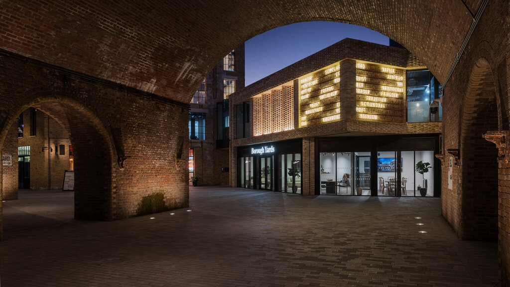 On 23 March, the SDS held their first in-person event of 2023. Wesley Meyer and Jamie Trippier of f.r.a. gave a tour of their work on Borough Yards in south London.
It was a dark and stormy night … no, it really was a dark and stormy night. So much so that people were calling to ask if we were going ahead with the planned tour. Of course we were. The Sign Design Society is made of hardy stuff. If you’re planning an outdoor event in the UK, you just accept there’s a good chance that it’ll rain.
We planned the tour to catch dusk so that we could see the lights coming on in Borough Yards and how the space transforms between day and night. The thick cloud might have made it slightly less bright than planned at the start, but it was still great to see the silhouettes of the buildings against the sky slowly vanish and the diverse lighting of the site gradually come into its own.
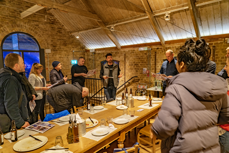
We started the evening avoiding the worst of the rain in Franco Manca, just across the road from the main entrance to Borough Yards. This not only gave us a handy meeting point, but also a welcome opportunity to catch up and chat before we started the tour proper. We ate pizza, drank beer, and hoped the rain would abate before we had to set out across the road. It was great to see so many regular and new faces in real life and not on a small square Zoom panel. We did loads of catching up and meeting new people.
Wesley Meyer and Jamie Trippier from f.r.a. were leading the tour, still buzzing from the previous evening when they were awarded gold for this very project in the Best Wayfinding category at the Transform Awards Europe 2023.
We began, sensibly still in the dry, with an introduction to the project. Wesley gave us the background to it and an overview of the space and their involvement with the development of the site.
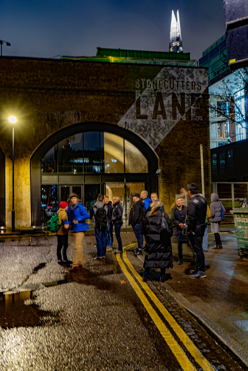
Once outside, first of all we stopped to look at the principal entrance from across the road in Stoney Street. Wesley explained how the architects were very open to suggestions about how the environmental graphics could be integrated into the architecture. At this entrance, the name of the site is painted onto the decorative brickwork, folding around the corner of the building at the entrance. It was great to hear about a project where the architects welcomed suggestions from the designers as to how the wayfinding and environmental graphics could be fully integrated into the architectural scheme.

Wesley also explained how each entrance to the site is treated differently. This was all part of a desire to make the site look more as if it had grown over time, and connected organically to the wider environment, rather than being simply shoe-horned into the space available as a heavily branded self-contained place.
Another aspect of the treatment of the site is the use of maps. A perennial problem with sites such as this is that tenants change, and you must figure out how to provide wayfinding and orientation information that can be readily updated as tenants change. f.r.a. proposed that the maps, rather than being high-spec pieces of product design, could instead be simply paper maps pasted to the walls. The low-tech ephemerality of these maps is foregrounded rather than being in any way concealed, even to the extent of welcoming them ending up not perfectly straight and square on the wall.
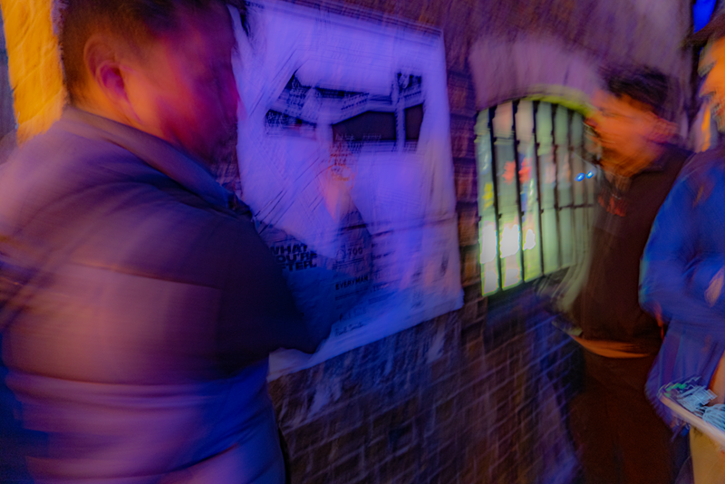
It’s a very different approach to your average, but one that works well in this context and encapsulates the look-and-feel of the site.
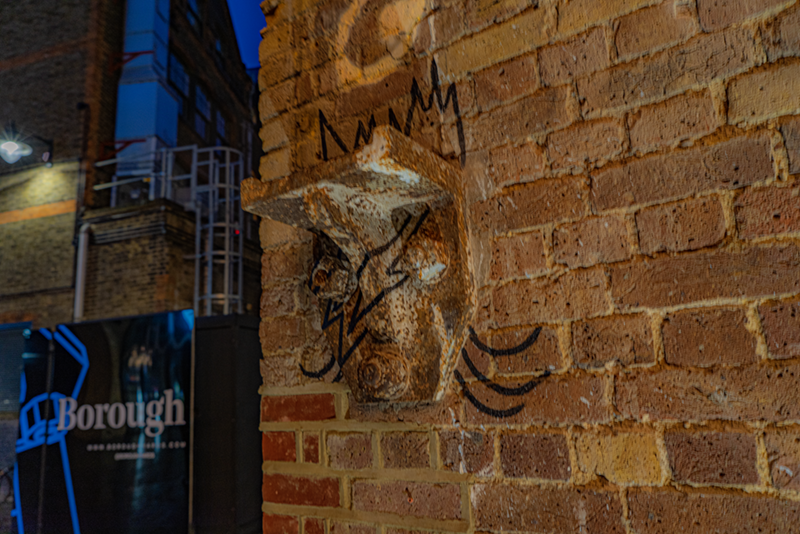
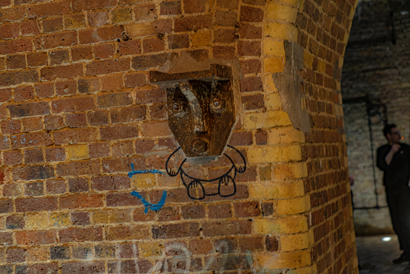
We also heard about and saw how the existing fabric of the site had been incorporated and celebrated. This included the whimsical reuse of structural ironwork, reimagined as a series of modern gargoyles.
We spent quite a while discussing one particular element of the project: a neon installation that functions as concrete poetry, placemaking device, and landmark.
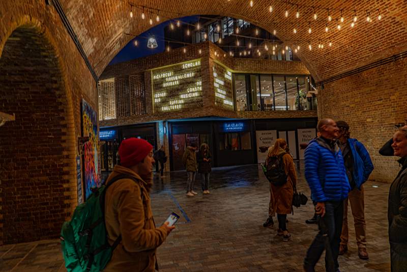
The neon installation comprises a series of terms that describe former denizens of this previously somewhat edgy slice of London. Different words in the installation light up at different times, creating an animated and intriguing insight into the past life of the site.
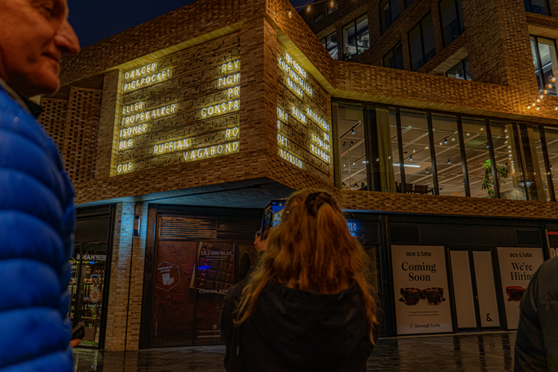
The architects originally had other plans for this piece of wall, but were readily convinced by f.r.a.’s suggestion for this prime location. As it is visible through the main entrance into the site, and overlooks the circulatory heart of the site, it is clearly a significant location both in terms of placemaking and navigation. It needed something to intrigue and animate. Wesley explained in detail the amount of time and effort that went into developing both the content and the technology that drives the neon installation. Apart from anything else, that amount of neon demands a substantial amount of cabling, all of which must be accommodated somewhere in the structure.
At the Dirty Lane entrance, we saw the idiosyncratic attention to detail, which had placed an intriguing plaque containing a teacup and a human tooth in a slightly out-of-the-way location as a reward for more observant visitors. The environmental graphic equivalent of an amuse bouche, perhaps.
Heading southwards down the site, we were able to access parts of the site not yet open to the public until their tenants move in.
We saw gates bearing messages which demonstrate that tone-of-voice is as important as the content of a message. What could have been blandly functional information became significant carriers of the personality of the site.
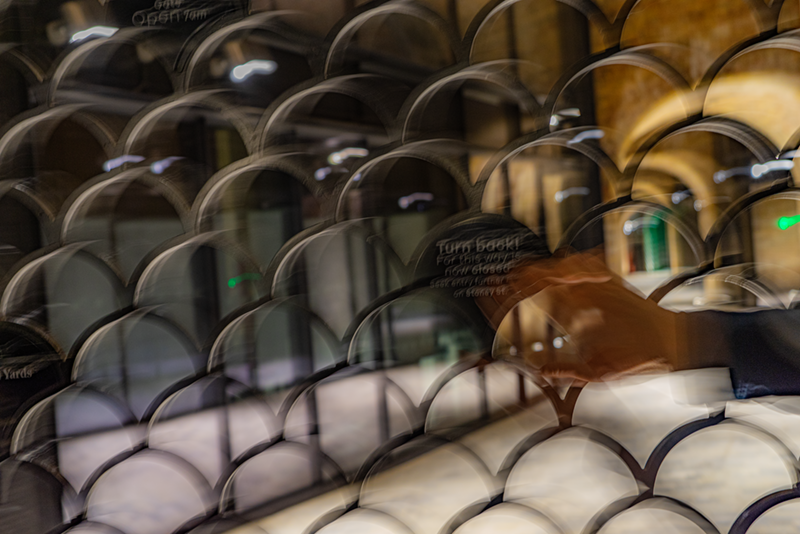
‘Turn back! For this way is now closed’ not only provides important information, but also speaks eloquently of the storied past of the site.
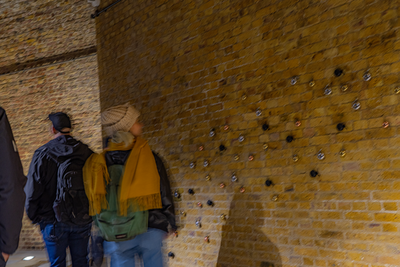
We also saw an installation of bicycle bells, all fully working and interactive, and totally analog. A tactile and engaging way to enliven one of the many beautiful brick walls (both old and new) that shape the site.
At the far end of the site, we found a final example of several new ghost signs that have been used to mark the space. This one marks the Stonecutters Lane entrance to the site.
